
I used to think a fillable PDF was successful as soon as the text boxes existed. That turned out to be a low bar. A form can be technically fillable and still be irritating enough that people abandon it, print it, or email back questions you thought the form had already answered.
Now I judge a fillable PDF much more simply: can a normal person open it and finish it without friction?
There are really two jobs here
The first job is making fields editable. The second job is making the form understandable. Most people focus on the first one because it is visible. In practice, the second one matters more.
If the field order is weird, the labels are vague, or the spacing feels cramped, the form still fails even though the fields technically work.
I try to think like the person filling the form out, not like the person who built it. That changes a lot of small decisions.
The checks I do before calling a form “ready”
- Do the fields follow a natural reading order?
- Are labels specific enough that nobody has to guess?
- Is there enough room for realistic answers?
- Can it still be completed on a laptop without zoom gymnastics?
Those checks sound boring, but they catch most of the frustration points early.
What I try to simplify
I do not like forms that ask users to decode the layout. If two fields belong together, I keep them visually together. If a section is optional, I make that obvious. If a signature is needed later, I do not clutter the early part of the form with it.
The smoother the path feels, the more likely people are to finish it correctly the first time.
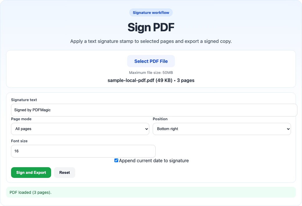
I prefer to separate filling from signing instead of cramming every action into the same visual moment.
One tiny thing that saves confusion: if the form includes deadline fields or date inputs, I sanity-check the format in ToolsKit Timestamp so “04/05” does not mean two different things to two different recipients.
What I usually test myself
- Open the form fresh.
- Tab through every field once.
- Fill it quickly without using the mouse too much.
- Check whether the final document still looks clean.
If tab order is chaotic or text starts overflowing, I know the form is not actually ready yet.
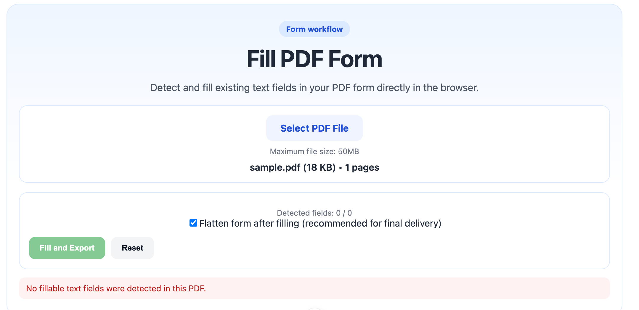
I recorded one full pass with a simple intake form because the useful test is not “look, the fields exist.” The useful test is whether I can open the file, move through the fields in a sane order, enter realistic answers, and export a finished copy without the layout feeling fragile.
This is the point where I usually notice whether a form is actually ready for other people. If the test run already feels fussy to me, I know it will feel worse to someone seeing it for the first time.
Where flattening comes in
Once the form is completed and no more editing is needed, I sometimes flatten the PDF before final handoff. That reduces the chance of field quirks, viewer issues, or accidental edits after the fact.
For that part, Flatten PDF is useful — but I only do it after I am sure the form is done. Flattening too early turns a flexible form back into a static page.
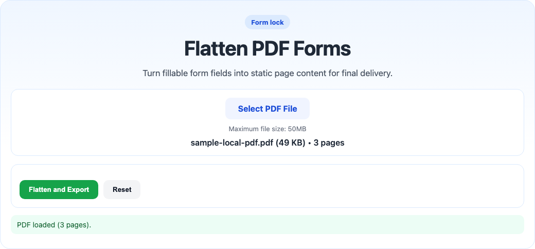
Flattening is great at the end of the process, but not when people still need to type into the file.
The little things that make forms feel better
- short section headings
- consistent field widths
- clear date formats
- enough white space around dense sections
None of those changes are flashy, but together they make a fillable PDF feel calmer and more trustworthy.
The moment I know the form is still too clever
If I need to explain the form layout before someone can finish it, the form is not done. Good fillable PDFs do not need much interpretation. They mostly just need to feel obvious.
One low-tech test I like is to tab through the form without using the mouse much. If the cursor jumps around in a weird order, that usually means the final user experience is rougher than the layout made me think.
My practical rule
If I would hesitate to hand the form to a busy person and say “this should only take two minutes,” then it is probably not ready. That is the standard I use now.
A good fillable PDF is not just editable. It is easy to finish.